Web design trends are ever-changing, evolving and adapting to the latest user behaviors. Each year, marketers learn a little bit more about how to design remarkable, highly functional websites that service different types of businesses and organizations.
As new technology emerges and user behaviors change, marketers are forced to find new and better ways to deliver the best possible user experience. As more data becomes available through advanced analytics and marketing automation processes, predicting customer behavior becomes easier, and designing personalized and intuitive user experiences becomes an expectation.
Your website is no longer a URL at which you park the existence of your online business. It’s often the first and most powerful presentation of your business – who you are as a company, what you offer, and why your products and services are better than all the rest.
Last year, we posted the blog, “What Makes a Great Website? 10 Website Trends for 2016“. In this year’s edition, you will see a mix of old and new web design trends for 2017. New trends are emerging all the time, and some of the existing trends are becoming further refined. Whether you’re ready to invest in a complete website redesign, or you’re simply wondering what makes a great website, this list should definitely get the wheels turning.
2017 WEB DESIGN TRENDS
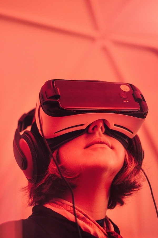
1. Virtual reality and 360-degree Video

Although virtual reality and 360-degree video are similar, let’s explore the differences between the two. VR, or virtual reality, requires the use of headsets, and provides an immersive experience which the user can control. A 360-degree video experience can be viewed on any device, without the use of headsets, and is typically controlled by the creator of the video. In 360-degree video, the user sits back and enjoys the experience, where with VR, the user controls the experience.
In either case, presenting website visitors with powerful introductory experiences is bound to take flight in 2017.
2. High Quality Photography
While stock photography certainly serves a purpose in a variety of situations, viewers prefer genuine, high quality photos to the overused image of people in business suits shaking hands. If you aren’t investing in quality photography for the majority of the images displayed throughout your website, your website may suffer in the long run.
Research indicates that photos that include real people can actually increase your conversion rates. While perfectly staged photos may seem intuitively more professional than candid photos, it’s important to remember that your audience is made up of real people who can relate to real images. By telling your brand story with genuine and high quality photography, your messaging will have a more powerful reach.
3. Extreme Minimalism
In 2016, minimalistic web design grew significantly in popularity. This year, the trend has evolved even further, into an even simpler design philosophy. Beyond just being concise and straightforward with all aspects of your web design, extreme minimalism (also referred to as ultra-minimal) is the idea of using the least amount of everything possible, while still conveying a powerful message.
Depending on your industry and business type, this design trend may or may not work for your audience. It’s definitely worth taking a look at how others are using it before making a decision. For example, this site by designer Mathieu Boulet is as minimalistic as they come. Whether or not it’s your cup of tea, it certainly makes a bold statement.
4. Mixing Text Directions
Who said text always has to go from left-to-right? What about top-to-bottom? Who says spacing has to be left-justified or centered all the time? If you’re looking to catch your viewers’ eyes and make them notice what you have to say, this design trend provides a unique way to display your company’s message.
It may not work throughout your entire site, as it could become frustrating to the reader to constantly be tilting their head. However, it’s definitely a powerful way to introduce yourself to your audience. Here’s an example of one such site: https://takewhatyoucancarry.com/
5. Branded Illustrations
While the use of unique illustrations to reflect your brand’s individual personality and tone is nothing new, it has recently become a more popular design trend. By using cartoon-like illustrations across your site, you can make the viewing experience a little more fun for your audience.
It’s important, however, to ensure that the illustrations are relevant and appropriate to your subject matter, and don’t take away from the professionalism of your site. If you can figure out how to use branded illustrations well, they may help to increase your brand reach and attract a broader audience.
6. Modular Web Design
Similar to Pinterest’s card design layout, modular web design takes it a step further by using blocks of different sizes that are purposefully positioned for the viewer. Each block may contain a set amount of text, an image (or multiple), or both.

By combining the use of distinct brand colors, simple blocks and concise messaging, modular design allows for an effective way to organize your website that is easy for users to view and digest. Here are two great examples of websites built using modular design: Swiss Watch Manufacturer, Corum and Native Shoes.
Not every web design technique is right for every type of business. It’s important to consider what design will resonate best with your audience, as well as what design will have the appropriate functionality based on your business needs and challenges. Knowing whether you should invest in a website redesign to better meet customer needs is a step in the right direction, no matter which trend you choose.


