Are you a startup looking to build a new website to be the digital face of your company? Or, are you an established business looking for a simple website refresh? No matter where you are in the web development process, if you are looking to develop a website, new or old, you should take the time to understand the importance of mobile first design.
There’s plenty of research out there that states some of the distinct benefits to designing for mobile first. By now, I’m sure you’ve heard the terms mobile-friendly, responsive design and so on. If you’re like the majority, you probably think they all are the same, just like a burrito and enchilada right? Wrong. Just like a burrito and enchilada, they all are relatively similar, but different at the same time.
Let’s look at the differences (sorry, not the burrito and enchilada) and how they all came to be a popular term among web design and the benefits each design method could potentially impact your overall traffic, lead capturing and conversions.
Mobile Friendly vs Responsive Design Vs Mobile First Design
Mobile Friendly Design
The term refers to a website that allows a user the usability to do just about everything on a mobile device as they would on a desktop, with minimal effects on site loading time and functionality. While it may not always be possible for a mobile version of a website to mirror every single function of the desktop version, a mobile friendly site typically aims to meet the majority of its mobile users’ needs.
For example, while the desktop version of a website might have large hero images on the home page, the mobile version will likely scale down the size of these photos, or remove them altogether. Similarly, while a desktop version of a website might display photos horizontally across the page, the mobile version may display these photos vertically. When using this web design approach, you may lose some of the functionality a desktop provides, however they typically are functions that are not used as frequently or needed on mobile.
When mobile friendly design first became popular, many businesses were rushing to adapt their existing websites to meet the requirements for functionality. Websites that don’t consider mobile users will likely see fewer and shorter visits, and lower engagement rates, as a result of the longer load times and limited functionality that mobile users will experience.
Responsive Web Design
Responsive web design not only encompasses the idea of a mobile friendly design, but is a broader term used to define the designing of web pages for a variety of screen sizes and orientations. When a website is built with responsive design features, the goal is to provide an optimal viewing experience for all users, no matter what type of device they are using.

The main difference between the two web design approaches is that mobile friendly design was originally seen as an afterthought or an add-on to an existing website. Responsive web design is a method used from the beginning of the web development process or in a website redesign. Although these terms are fairly similar, it’s important to understand the differences between them when talking about the history of web design and the progression over time.
Mobile First Design Methodology
For a long time, website design first focused on creating the most optimal user experience for the largest screen size a user would be on, such as a desktop screen. Designing for mobile first takes the age old habit of designing for the biggest possible screen first, and designing for the smallest possible screen first.
With the rise in popularity of mobile website viewing, mobile web design provided an alternative to the main desktop viewing experience. Thus, responsive web design was born as a solution to having to create multiple web designs – one for desktop, one for mobile, etc. The method of designing for mobile first takes this one step further, and is based on the idea that the optimal viewing experience should be on a mobile device vs. a desktop device.
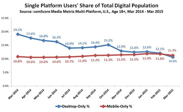
According to recent research done by comScore, “desktop only has been on a pretty steady decline since 2014, dropping from 19.1% to 10.6%. On the other hand, mobile only has been on the rise with no expectations to slow down. Considering the trend, desktop viewing may no longer be the norm. Therefore, it’s important to optimize on the devices your audience is using, and not those they aren’t.

Some aspects of a website that are designed for the desktop simply cannot be recreated on a mobile screen. So why wouldn’t you design specifically for a mobile screen? Anything that can be viewed on a mobile version can also be viewed on a desktop version. Instead of trying to fix the issues that often accompany trying to scale a large screen experience down to a small screen experience, starting with mobile works within the limitations of the smaller screen from the beginning.
Benefits of Designing for Mobile First
If you want your users to have the best possible experience on mobile and desktop devices, designing for mobile first is the way to go. You won’t have to worry about there being mobile feature constraints, or slower loading times when using a mobile device. Google shouldn’t penalize you either, since your website will load fast from any viewing device.
Finally, taking a mobile first design approach allows you to think about what actually needs to be on your site. Instead of trying to fill in all the whitespace with fluff, you focus on what the user actually wants/needs to complete the action. In order to maintain optimal functionality, you’ll work harder to make sure your site is full of only the most critical content and features necessary to help your business succeed.


