Resizing images for your website to balance the fastest possible page load speeds with clean aesthetics is something that is often overlooked by website owners. If you have ever worked with a web designer or other marketing professionals, you know they’re bound to ask you for some images of your business. What we as designers run into, are images that are either much too large or much too small to display properly on your website.
Now, of course, we are happy to work with whatever you provide, but prefer you to save your pennies for the hardcore work of developing a kick-butt website with awesome functionality that both your readers and googlebot will love.
Some Insight on Web Images
Sizing is a big deal – PPI, or pixels per inch means exactly that: How many little square pixels are in an inch of screen space. To give you a real life example: your typical hero image (the image that spans the full width of a nice looking webpage) is on average, 1600px wide by 500px tall in order to display well without being fuzzy. Think of that as your reference point whenever you’re sizing images to send to your designer. ProTip: When you work in pixels, you don’t have to figure out size translations to and from inches – a pixel is a pixel, whether you’re saving at 72 PPI (most common for web) or 300 (standard for printing).

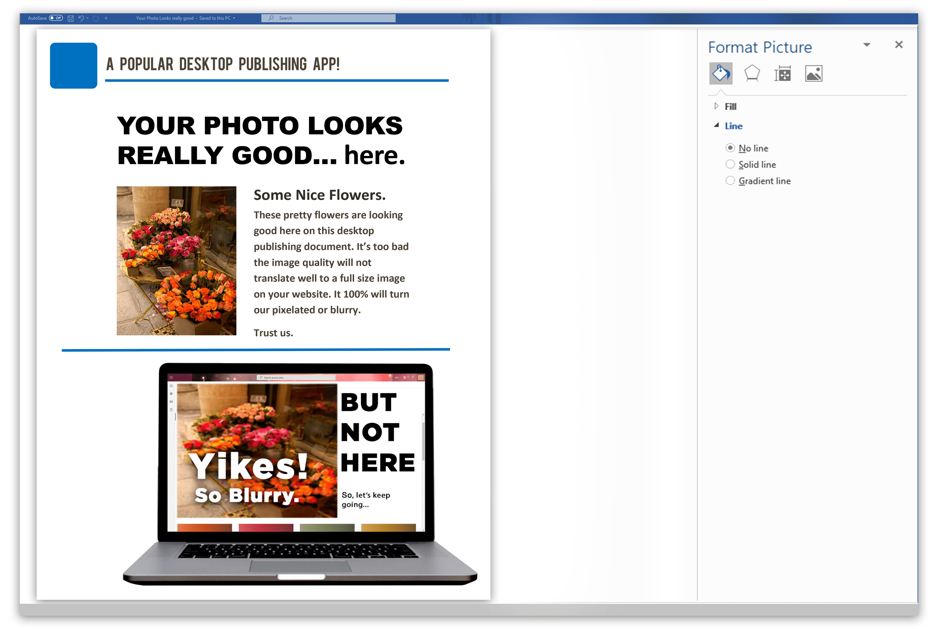
If you have a giant 5000px wide image, ok no problem, it’s easy to size DOWN, but if you have a small image that is say, 300px by 200px, it is going to make everyone think they need better glasses when they see it on the screen when it is sized up. A good rule of thumb is to resize your images to be at, or just above the intended display size, as well as a very similar aspect ratio. No one wants a squashed or stretched out image. Shutterstock has a great article on aspect ratios we think is worth a read. Of course, your ideal image size will be based on your context, but some good sizes to use as a guideline are:
Full-screen images — These images cover the screen, edge to edge. In terms of pixel dimensions, keep these at 2400×1600 px to look good on screen.
Content images (within a page) — These images could be inside an article, slideshow galleries, call-to-action areas, or within your blog posts. For horizontal images, the maximum width should be 1500 px. For vertical images, keep to a width of 1000 px or smaller.
Now, here is where it gets confusing. Pixel dimensions do not correlate directly to file size. The best-practice file size rule is to upload images no larger than 300 KB, but that size is usually reserved for hero images and similar. If your blog contains many photos, each one will take up space toward your web page’s total size.
In keeping each page below 500 KB, you should be compressing images as much as you can without sacrificing quality, and only using images which add value to your content. When you work with CommonPlaces for your website design, we use image compression software that handles your file size so you don’t have to worry TOO much, but getting as close as possible from the get-go can ensure your image quality remains how you intend.
Help – I have no idea how to get all these image size numbers!
It really is a learning curve to get the “right” sized images over to your designers. If you are not a professional photoshop user, you probably need a way to figure all this out. Below, we list some decent tools to help with that.
Online Image Resizing Tools:
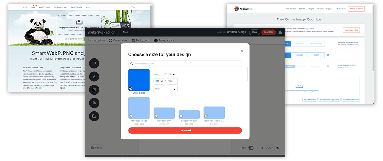
Kraken.io – bulk image compressor which allows you to optimize several images at once and download them in a zip format, or compress individually.
TinyPNG – allows you to reduce the file size of both PNGs and JPEGs. Keep in mind though, PNGs have a larger file size than other extensions, so select this extension carefully. It is best reserved for images with crisp lines (like logos, as opposed to photographs.)
Shutterstock Editor – “Shutterstock Editor is a free design tool that allows you to resize images for a variety of purposes and social media platforms.” –Shutterstock.com Their editor allows you to resize and crop images to reduce the file size by uploading your image and changing the canvas dimensions. When you go to download your edited image, you can then select the file size along with the PPI.

Image Resizing Desktop Apps:
JPEGmini – Reduce JPEG file sizes quickly with a “quality” slider and a preview function so you can see lossy compression, and choose the most efficient image size.
PNGGauntlet – is a tool that achieves the smallest PNG file size possible without reducing quality, and can convert .jpg .gif .tiff and .bmp files to .png output.
How do i choose the type of image file to send my designer?
JPEG – used for photos, screenshots, and most other images. These use lossy compression, which means image data is degraded a bit to reduce file size. You can adjust JPEG quality settings to balance image quality vs. file size. On many photographs, limiting the image quality is barely noticeable, so you want to aim for the smallest file size you can get away with.
PNG – best for illustrated shapes like logos because edges will look clean on screen, and they can be saved with transparency. PNGs hold onto all of the image data via lossless compression, but file size will typically be larger than other formats.
GIF – used for animations where short animated graphics are necessary – but avoid this format for still images.
Whichever tools you use to resize your images, you will typically have an option to select which filetype to save as, so be sure to choose the most appropriate for your intended usage.
|

There you have it. If you are providing images, you will score major points with your designers when you send files that are ready to upload. But don’t worry – if you need a walkthrough when you start your project with us, our CommonPlaces design team will be happy to give you a step-by-step on saving your site-specific images so that everything goes smoothly.

 A Note on Image File Types to Avoid Sending Your Designer:

