In order to accomplish this, however, we devote a great deal of time learning the mission and goals of each non-profit we partner with. We then focus our attention on what we consider to be the essentials for every non-profit website, so that we can properly highlight those goals and the mission statement. Visitors to a non-profit website tend to be passionate, and it is our job to generate success for the organization by capturing that passion. The surest way to realize that is to add these features to every non-profit website that we design:
A Clear Non-Profit Mission Statement
It’s important that every visitor knows what your organization is all about. Be clear, be concise, and be direct. Sum up your message in just a couple of sentences, and put it out there for the entire world to see.
Make it Easy to Donate Online
Non-profits exist because of supporters. Give them easy access to donation options the moment they land on your website by putting some kind of a Donate Here button front and center.
Media About Those You Serve
Pictures and videos showing the work you’ve done should greet every visitor to your site. Testimonials are an excellent way of proving that donations produce results. If your organization also attracts people who need your help, this will go a long way to convincing them that you are for real.
Accessible Contact Information
Visitors could be potential volunteers, donors, or people seeking your services. Don’t ask them to come find you, give them contact information right away.
News and Events Content
Let every visitor know that you are an active organization by providing updated information on your community activities. What you are planning, what you have been doing lately, and what your goals are should be prominently featured on your home page. It is vital that you keep this current.
Historical Background
Put your organization in some kind of historical perspective. Why are you here? Why are you needed? You may combine this with a mission statement elsewhere on one of your pages, but be sure to include it as background for all those who want to get to know you a little better.
Staff and Team Information
Visitors crave assurances that their support and commitment to you is well placed. Provide background information on the people who serve this cause. Go ahead ‘- brag about yourselves!
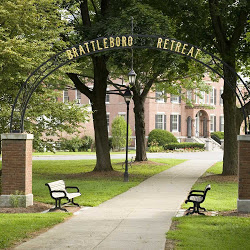
CommonPlaces is proud of its association with many fine non-profits. An example of one website with which we are affiliated is http://www.brattlebororetreat.org Please visit their website to see how their design follows these criteria and, while there, take the time to learn more about them. They do good work.


